Overview
My high school requires all incoming freshman to take AP Computer Science Principles. Our teacher asked us to create questions, added it to a Microsoft Form and sent us all the link to fill out. A week later, he gave us all the data. I took the data and cleaned it up, removing all the unnecessary columns and rows. I then analyzed the data to find correlations between different questions and visualized the data to make it easier to understand.
All code is original content and available in analysis.ipynb. It works for my environment and on GitHub, so there's no reason it shouldn't work for you if you run everything sequentially.
Data source
This project is meant to be a learning experience and a school assignment and not to be used for any other purpose. Consent was not acquired from the students to share the data publicly; as such, the data is not available for download, however if you get access to the dataset by going to my school or being my CSP teacher, just follow the instructions in my repository to use my utility scripts and clean up the data.
Correlations
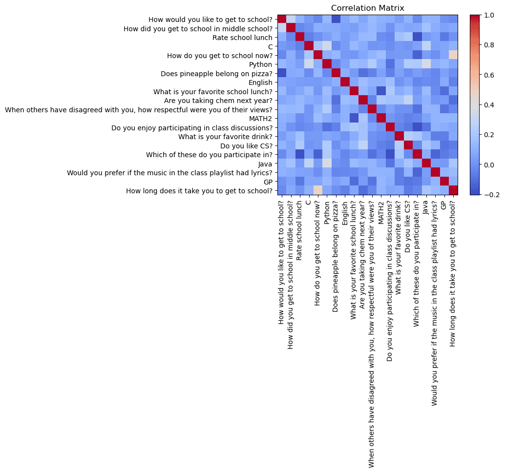
Correlation chart
The correlation matrix is used to find columns that relate to each other or correlate. This can help brainstorm ideas for future visualizations. My code randomly chooses 20 columns from the cleaned data and analyzes the correlation. You only need to look at the data under and to the left of the red squares as it is mirrored to the other side.

Strongest correlations
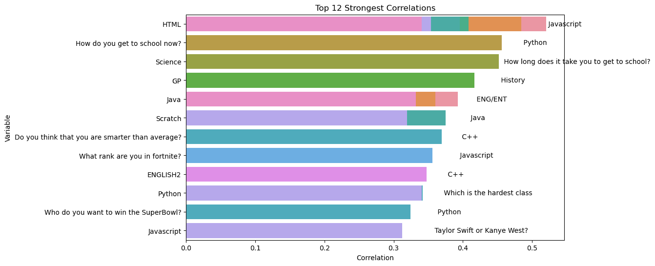
My code selects the 12 strongest correlations from the 58 rows x 163 columns cleaned dataset.

Interesting correlations
Seeing as the highest correlation has a R-score of 0.5, most of these correlations are moderately weak. However, they do denote a relationship.
Here's some of the stronger correlations that I found interesting or made sense to me. I also included my thoughts on why this is the case.
- HTML and Javascript rank first and have the strongest correlation. The question asks people to select how much expertise they have with the language. I believe the reason for this is that HTML and JS are usually taught together to web developers and make up the bulk of the World Wide Web (aside from simple, static sites).
- "How do you get to school now?" and Python proficiency. This one isn't as direct. I'm not sure why it has a strength of about 0.46 but maybe it's because kids who know more Python tend to have parents that work harder and drive them to school or they live farther away so they take the bus?
- GP (graphic production) and history rank fourth on this list. History is one of the humanities and so is art, so maybe this is because GP is similar to art and people are interested in both?
- "Do you think that you are smarter than average?" and C++ have a decently strong correlation. C++ developers would usually think they're smarter than average.
On a side note, I wanted to talk about the complexity of these operations and the math behind them.
Calculating the strongest correlations
Let's break this down:
Pairwise correlation
- Calculating the pairwise correlation for a matrix of size
m x n(m is the number of rows, n is the number of columns) generally has a time complexity ofO(n^2 * m)because each pair of columns requires O(m) operations to compute. There are Nc2 pairs which isn^2 / 2. For this dataset, this is58 * 58 * 0.5 * 163or about 274, 000.
Absolute value
- Getting the absolute value of the matrix is O(n^2) as it requires going through each element of the
n x ncorrelation matrix but this is a minor operation compared to calculating the correlation.
Masking the mirrored triangle
-
Creating the mask also takes O(n^2) as we are iterating over the
n x nmatrix again to set the triangle. -
Unstacking the matrix which moves it from a 2D array to a 1D one with labels takes
O(n^2 log(n^2))which is equal toO(2 n^2 log n)since there are n^2 elements in the correlation matrix and sorting them takesO(n^2 log n). -
Selecting the top 12 correlations is just
O(1)because you just pick the top 12 elements form the sorted elements.
Analyzing the sport-related data
I'll be honest, I didn't feel like cleaning all 489 responses to the three questions I drew upon. It would have been easy to visualize if the questions were multiple choice or multi-select. Instead, I took the following steps for my visualizations:
-
Pre-process the data
- Select the sport questions and create a new csv file for them and initialize a DataFrame.
- Clean the data: convert everything to lowercase, remove punctuation, and filter out stopwords like "year" or "and".
-
Count word frequencies
-
Generate and plot the wordcloud and network graph
The wordcloud
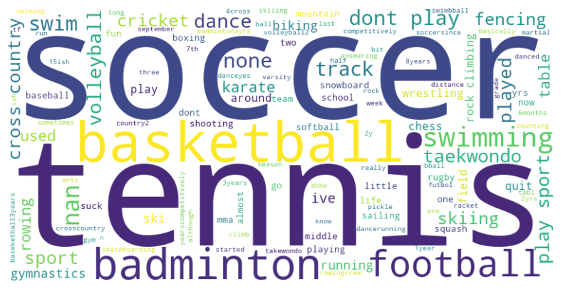
The wordcloud is a representation of the most common words in the sports-related questions. The size of the word represents the frequency of the word in the dataset. The wordcloud is generated using the wordcloud library in Python.
Some of the most popular sports are soccer, tennis, basketball, football and badminton.

The network graph
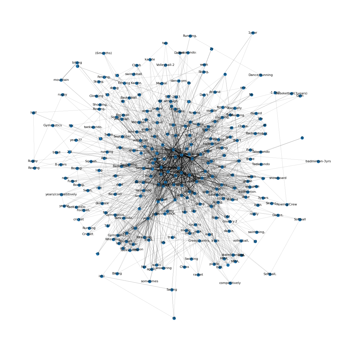
The network graph is a representation of the relationships between the words in the sports-related questions. Each node represents a word in the dataset. When words are used together, they are connected by a line. The thickness of the edge represents the frequency of the words being used together.
Things to notice:
- While it seems like there are a lot of duplicate words, each word is unique.
- I did not try to clean the dataset intensively and only removed some punctuation and whitespaces.
- There are many different spellings of the same word, abbreviations, slang, etc.
- At the center, there are popular sports like basketball, dance, tennis, etc. There are also many keywords like "and", "play", "sports", etc. which are used in the responses.
