Introduction
Welcome to my Spotify Listening History Analysis! In this project, I have analyzed my extended streaming history from Spotify using Python. I have used data-driven insights to uncover interesting trends and patterns in my music listening habits.
To perform the analysis, I wrote Python code that processed the raw data obtained from Spotify's extended streaming history download. The code is available in my GitHub repository, which you can find here.
In this analysis, I explored various aspects of my listening history, such as:
- Top artists and tracks
- Time-based trends
- Distribution of listening
By visualizing the data, I was able to gain a deeper understanding of my music preferences and discover new insights about my listening habits.
Feel free to explore the different sections of this analysis to learn more about my Spotify listening history. If you have any questions or feedback, please don't hesitate to reach out.
Happy exploring!
Organizing the data
File conversion
I used the pandas library to read the data of the Streaming_History_Audio_2020-2023.json file spotify gave me and converted it into a CSV file.
While JSON displays the data in a nested format, one entry at a time, CSV is easier for me to work with as it displays the data in a tabular format, so I can understand and view multiple entries for the same column at the same time.
Dropping columns
Originally, the data had the following columns:
RangeIndex: 13509 entries, 0 to 13508
Data columns (total 21 columns):
 #   Column                             Non-Null Count  Dtype
---  ------                             --------------  -----
 0   ts                                 13509 non-null  object
 1   username                           13509 non-null  object
 2   platform                           13509 non-null  object
 3   ms_played                          13509 non-null  int64
 4   conn_country                       13509 non-null  object
 5   ip_addr_decrypted                  13509 non-null  object
 6   user_agent_decrypted               11607 non-null  object
 7   master_metadata_track_name         13402 non-null  object
 8   master_metadata_album_artist_name  13402 non-null  object
 9   master_metadata_album_album_name   13402 non-null  object
 10  spotify_track_uri                  13402 non-null  object
 11  episode_name                       20 non-null     object
 12  episode_show_name                  20 non-null     object
 13  spotify_episode_uri                20 non-null     object
 14  reason_start                       13509 non-null  object
 15  reason_end                         13509 non-null  object
 16  shuffle                            13509 non-null  bool
 17  skipped                            13201 non-null  float64
 18  offline                            13509 non-null  bool
 19  offline_timestamp                  13509 non-null  int64
 20  incognito_mode                     13509 non-null  bool
dtypes: bool(3), float64(1), int64(2), object(15)
There are some columns I don't need for this analysis, like the episode related columns (11, 12, 13), the columns related to my device (5, 6), my username, platform, country, etc.
I wanted to analyze the data about the following, so I kept the following columns:
ts- Timestamp of when the song was playedms_played- Duration of the song played in millisecondsmaster_metadata_track_name- Name of the trackmaster_metadata_album_artist_name- Name of the artist
Below is a sample of the dataframe now.
Dataframe sample
| Timestamp | Milliseconds | Track name | Artist |
|---|---|---|---|
| 2023-01-05 22:08:03+00:00 | 10449 | 20 Min | Lil Uzi Vert |
| 2022-06-10 03:28:42+00:00 | 8750 | All My Life (feat. J. Cole) | Lil Durk |
| 2023-05-21 15:16:20+00:00 | 223173 | TOPIA TWINS (feat. Rob49 & 21 Savage) | Travis Scott |
| 2022-10-22 17:00:49+00:00 | 21841 | BAD! | XXXTENTACION |
| 2023-04-16 18:16:59+00:00 | 3065 | Summertime In Paris | Jaden |
Creating new columns
I created new columns from the timestamp and milliseconds played columns for easier analysis. Read below to see what columns I created.
play_time- Datetime formatted timestampyear- Year when the song was playedmonth- Month when the song was playedday- Day when the song was playedweekday- Day of the week when the song was playedhour- Hour when the song was playedminute- Minute when the song was playedtime- Time when the song was playedday-name- Name of the day when the song was playedcount- Count of the song playedtime_played- Duration of the song played in a timedelta formattime_played_hours- Duration of the song played in hourstime_played_minutes- Duration of the song played in minutes
Here is the code I used to create these columns:
spotify_stream_df['play_time'] = pd.to_datetime(spotify_stream_df['ts'])
spotify_stream_df['year'] = pd.DatetimeIndex(spotify_stream_df['play_time']).year
spotify_stream_df['month'] = pd.DatetimeIndex(spotify_stream_df['play_time']).month
spotify_stream_df['day'] = pd.DatetimeIndex(spotify_stream_df['play_time']).day
spotify_stream_df['weekday'] = pd.DatetimeIndex(spotify_stream_df['play_time']).weekday
spotify_stream_df['hour'] = pd.DatetimeIndex(
    spotify_stream_df['play_time']).hour
spotify_stream_df['minute'] = pd.DatetimeIndex(
    spotify_stream_df['play_time']).minute
spotify_stream_df['time'] = pd.DatetimeIndex(spotify_stream_df['play_time']).time
spotify_stream_df['day-name'] = spotify_stream_df['play_time'].apply(lambda x: x.day_name())
spotify_stream_df['count'] = 1
spotify_stream_df['time_played'] = pd.to_timedelta(spotify_stream_df['ms_played'], unit='ms')

def hours_played(time):
    return time.seconds / 3600
def minutes_played(time):
    return time.seconds / 60 % 60

spotify_stream_df["time_played_hours"] = spotify_stream_df["time_played"].apply(
    hours_played).round(3)
spotify_stream_df["time_played_minutes"] = spotify_stream_df["time_played"].apply(
    minutes_played).round(3)
Final table
| ts | ms_played | master_metadata_track_name | master_metadata_album_artist_name | play_time | year | month | day | weekday | hour | minute | time | day-name | count | time_played | time_played_hours | time_played_minutes |
|---|---|---|---|---|---|---|---|---|---|---|---|---|---|---|---|---|
| 2023-06-12 22:14:27+00:00 | 5189 | That Fiya | Lil Uzi Vert | 2023-06-12 22:14:27+00:00 | 2023 | 6 | 12 | 2 | 22 | 14 | 22:14:27 | Wednesday | 1 | 0 days 00:00:05.189000 | 0.001 | 0.083 |
| 2023-06-12 22:14:30+00:00 | 3157 | 5!RE | Homixide Gang | 2023-06-12 22:14:30+00:00 | 2023 | 6 | 12 | 2 | 22 | 14 | 22:14:30 | Wednesday | 1 | 0 days 00:00:03.157000 | 0.001 | 0.050 |
| 2023-06-12 22:16:20+00:00 | 110926 | Go | Ken Carson | 2023-06-12 22:16:20+00:00 | 2023 | 6 | 12 | 2 | 22 | 16 | 22:16:20 | Wednesday | 1 | 0 days 00:01:50.926000 | 0.031 | 1.833 |
| 2023-06-12 22:19:33+00:00 | 192213 | Like This (feat. Lil Uzi Vert, Destroy Lonely) | Ken Carson | 2023-06-12 22:19:33+00:00 | 2023 | 6 | 12 | 2 | 22 | 19 | 22:19:33 | Wednesday | 1 | 0 days 00:03:12.213000 | 0.053 | 3.200 |
| 2023-06-12 23:42:58+00:00 | 113030 | Fighting My Demons | Ken Carson | 2023-06-12 23:42:58+00:00 | 2023 | 6 | 12 | 2 | 23 | 42 | 23:42:58 | Wednesday | 1 | 0 days 00:01:53.030000 | 0.031 | 1.883 |
Graphing the Top Artists
First, we group the streaming dataframe by adding all the counts of the songs played by the same artist and the time played. Then we sort the data by the hours played and take the top 10 elements from that to get the top 10 artists.
top_artists = spotify_stream_df.groupby(['master_metadata_album_artist_name'])[
    ['count', 'time_played_hours']].sum().sort_values(by='time_played_hours', ascending=False)
top_10_artists = top_artists.head(10)
Using matplotlib
We'll use the matplotlib library to plot the bar graph and we'll use the seaborn library for the style. The x-axis will have the artist names, and the y-axis will have the hours played.
import matplotlib.pyplot as plt
import seaborn as sns

sns.set_theme(style="whitegrid")
palette = sns.color_palette("viridis", 10)

plt.figure(figsize=(12, 8))
bars = plt.bar(top_10_artists.index,
               top_10_artists['time_played_hours'],
               color=palette,
               edgecolor='black')
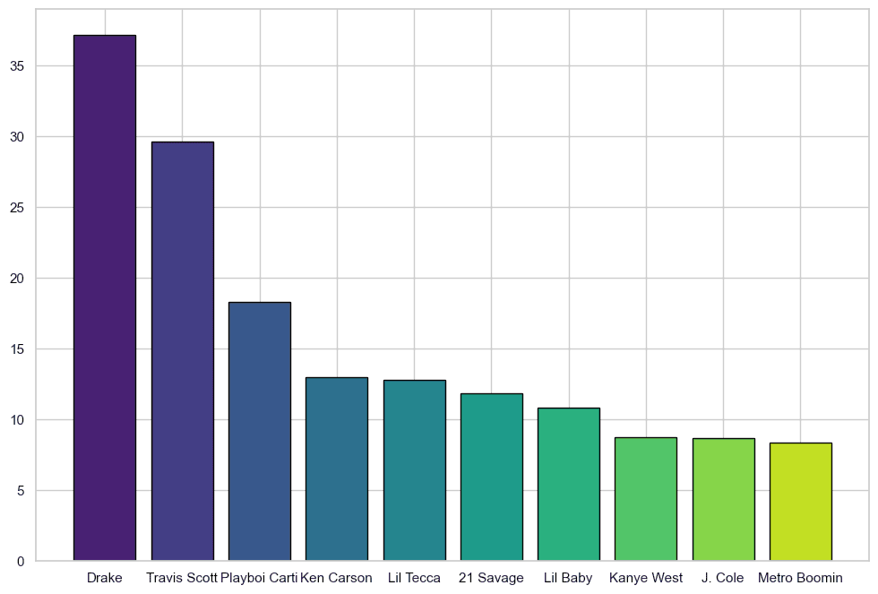
Initial graph
Things to notice:
- The x-axis text is cramped and looks weird.
- The font size doesn't match the graph
- It doesn't have any labels or title
- The exact values are not shown on the bars
Improving the graph
We now have a working bar graph. Let's add some labels and make it more presentable.
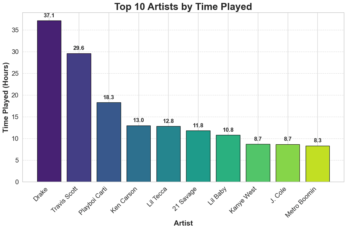
Bar graphs are primarily used for comparing data, but we can add the exact values on top of the bars to give more information.
for bar in bars:
    yval = bar.get_height()
    plt.text(bar.get_x() + bar.get_width()/2, yval + 0.5, round(yval, 1),
             ha='center', va='bottom', fontsize=14, fontweight='bold')
The x axis text is still a little cramped, which we'll fix by rotating the artist names 45 degrees so that they are still readable and can take up more space.
We'll also add x and y axis labels, a title, and gridlines.
# Improve labels and title
plt.xlabel('Artist', fontsize=18, fontweight='bold')
plt.ylabel('Time Played (Hours)', fontsize=18, fontweight='bold')
plt.title('Top 10 Artists by Time Played', fontsize=24, fontweight='bold')
plt.xticks(rotation=45, ha='right', fontsize=16)
plt.yticks(fontsize=16)

# Show gridlines for y-axis
plt.grid(axis='y', linestyle='--', alpha=0.7)
plt.tight_layout()
Final time played graph
I still think the aesthetics could be improved and maybe more information could be added, like the time played of the artist's top song, but this is a good start and conveys the necessary information.
Top artists by song count
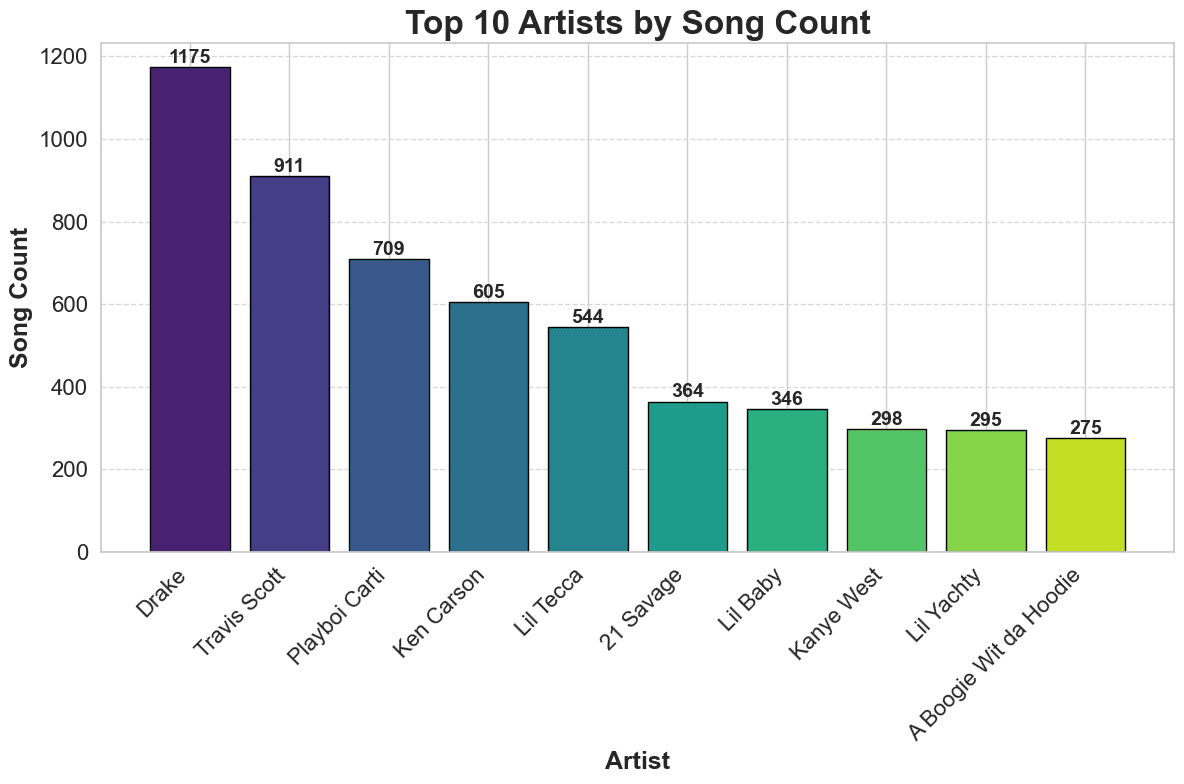
We can also graph the top artists by the number of songs played. The process is similar to the one above, but we'll use the count column instead of the time played column. I'll reuse the rest of the code.
Compare the two graphs. You can see that the top artists by time played are different from the top artists by song count, which is interesting. Make your assumptions as to why this is the case.
Plotting the top songs
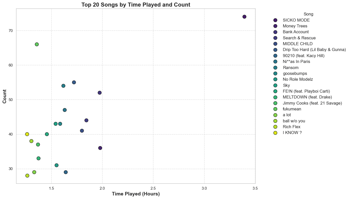
Let's start by calculating the top songs by the time played. We'll group the dataframe by the track name and sum the time played. Then we'll sort the values and take the top 20 songs.
# Calculate top songs
top_songs = spotify_stream_df.groupby(['master_metadata_track_name'])[
    ['count', 'time_played_hours']].sum().sort_values(by='time_played_hours', ascending=False)
top_20_songs = top_songs.head(20).reset_index()
Scatterplot
We'll use a scatterplot with the x-axis being the time played and the y-axis the count played.
plt.figure(figsize=(14, 8))

sns.scatterplot(data=top_20_songs, x='time_played_hours', y='count',
                hue='master_metadata_track_name', palette='viridis', s=100, edgecolor='black')

plt.xlabel('Time Played (Hours)', fontsize=14, fontweight='bold')
plt.ylabel('Count', fontsize=14, fontweight='bold')
plt.title('Top 20 Songs by Time Played and Count',
          fontsize=16, fontweight='bold')
plt.legend(title='Song', bbox_to_anchor=(
    1.05, 1), loc='upper left', fontsize=12)

plt.grid(axis='both', linestyle='--', alpha=0.7)
plt.tight_layout()
plt.show()
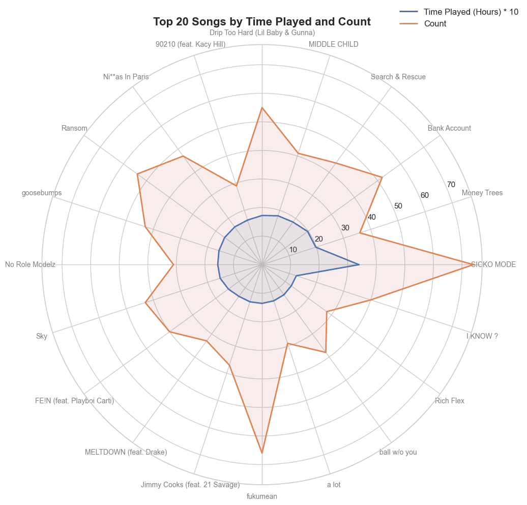
Radarplot
I won't bore you with the details but you could probably figure out how it works from the code below. This isn't a great way to use a radarplot but I just wanted to experiment with the format.
from math import pi
import matplotlib.pyplot as plt

top_songs = spotify_stream_df.groupby(['master_metadata_track_name'])[
    ['count', 'time_played_hours']].sum().sort_values(by='time_played_hours', ascending=False)
top_20_songs = top_songs.head(20).reset_index()

# Prepare data for radar chart
labels = top_20_songs['master_metadata_track_name']
num_vars = len(labels)

# Compute angle for each axis
angles = [n / float(num_vars) * 2 * pi for n in range(num_vars)]
angles += angles[:1]

# Radar chart data
time_played_scaled = (top_20_songs['time_played_hours'] * 10).tolist()
time_played_scaled += time_played_scaled[:1]
count = top_20_songs['count'].tolist()
count += count[:1]

plt.figure(figsize=(12, 10))

ax = plt.subplot(111, polar=True)
plt.xticks(angles[:-1], labels, color='grey', size=10)
ax.plot(angles, time_played_scaled, linewidth=2,
        linestyle='solid', label='Time Played (Hours) * 10')
ax.fill(angles, time_played_scaled, 'b', alpha=0.1)

ax.plot(angles, count, linewidth=2, linestyle='solid', label='Count')
ax.fill(angles, count, 'r', alpha=0.1)

plt.title('Top 20 Songs by Time Played and Count',
          size=16, fontweight='bold', position=(0.5, 1.1))
plt.legend(loc='upper right', bbox_to_anchor=(1.1, 1.1), fontsize=12)
plt.tight_layout()
plt.show()
Streams by day of the week
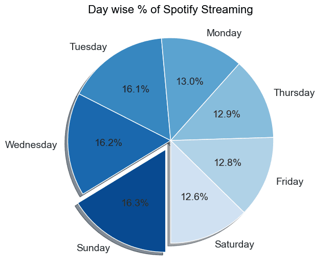
We can use the day-name column of the dataframe and get the value counts to see which days I stream the most.
Pie chart
import matplotlib.cm as cm

day_name_counts = spotify_stream_df["day-name"].value_counts()
fig = plt.figure(figsize=(8, 6))
ax = fig.add_subplot(111)
colors = cm.Blues(np.linspace(0.9, 0.2, len(day_name_counts)))

# Get the maximum index
max_index = day_name_counts.argmax()

# Create an explode list
explode = [0] * len(day_name_counts)
explode[max_index] = 0.1

# Plot the pie chart
ax.pie(day_name_counts, labels=day_name_counts.index, colors=colors, autopct='%1.1f%%', startangle=-90,
       textprops={'fontsize': 14}, explode=explode, shadow=True, counterclock=False)

# Set the title and axis aspect ratio
ax.set_title('Day wise % of Spotify Streaming', pad=20, fontdict={
             'color': 'black', 'weight': 'normal', 'size': 16})
ax.axis('equal')

plt.show()
This is good but I want to know if this changed over time. I'll create a lineplot to show the streams by day of the week over every month.
Lineplot
import pandas as pd
import matplotlib.pyplot as plt
import seaborn as sns

# Ensure 'ts' column is in datetime format
spotify_stream_df['ts'] = pd.to_datetime(spotify_stream_df['ts'])

# Filter data for the years 2022 and 2023
filtered_df = spotify_stream_df[spotify_stream_df['ts'].dt.year.isin([
                                                                     2022, 2023])]

# Extract month and year
filtered_df['year_month'] = filtered_df['ts'].dt.to_period('M')

# Aggregate data by month
monthly_streams = filtered_df.groupby(
    ['year_month', 'day-name']).size().reset_index(name='count')

# Convert 'year_month' back to datetime for plotting
monthly_streams['year_month'] = monthly_streams['year_month'].dt.to_timestamp()

plt.figure(figsize=(14, 8))
sns.lineplot(data=monthly_streams, x='year_month', y='count',
             hue='day-name', marker='o', palette='tab10')

plt.title('Monthly Spotify Streams by Day of the Week (2022-2023)',
          fontsize=16, fontweight='bold')
plt.xlabel('Month', fontsize=14, fontweight='bold')
plt.ylabel('Number of Streams', fontsize=14, fontweight='bold')
plt.legend(title='Day of the Week', bbox_to_anchor=(1.05, 1), loc='upper left')
plt.xticks(rotation=45)
plt.grid(True)
plt.tight_layout()
plt.show()
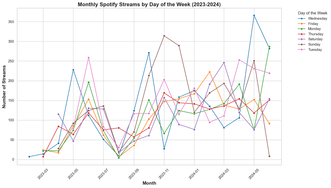
Interesting! The month of August 2022 had the most streams on a Thursday, while the rest of the days showed massively reduced streams.
Streams by hour and day
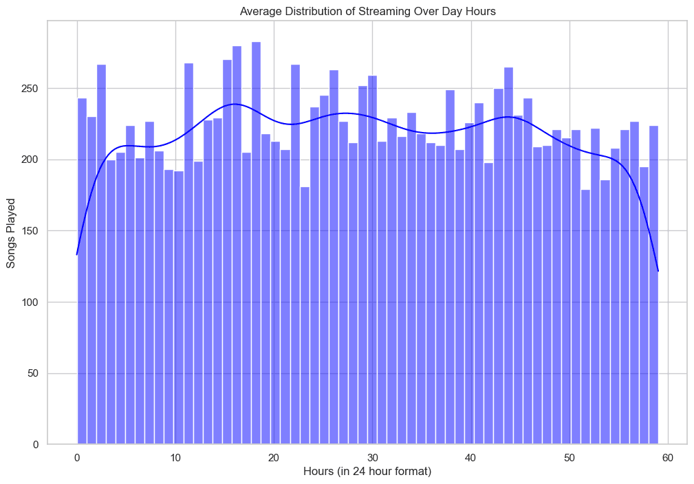
I want to see if there is a trend in the minute of an hour when I stream. For example, do I stream more in the second part of an hour or the first?
Hourly distribution
fig, ax = plt.subplots(figsize=(12, 8))
ax.set(title="Average Distribution of Streaming Within an Hour",
       xlabel="Minute (0-59)", ylabel="Songs Played")
sns.histplot(spotify_stream_df["minute"], bins=60, kde=True, color="blue")
Daily distribution
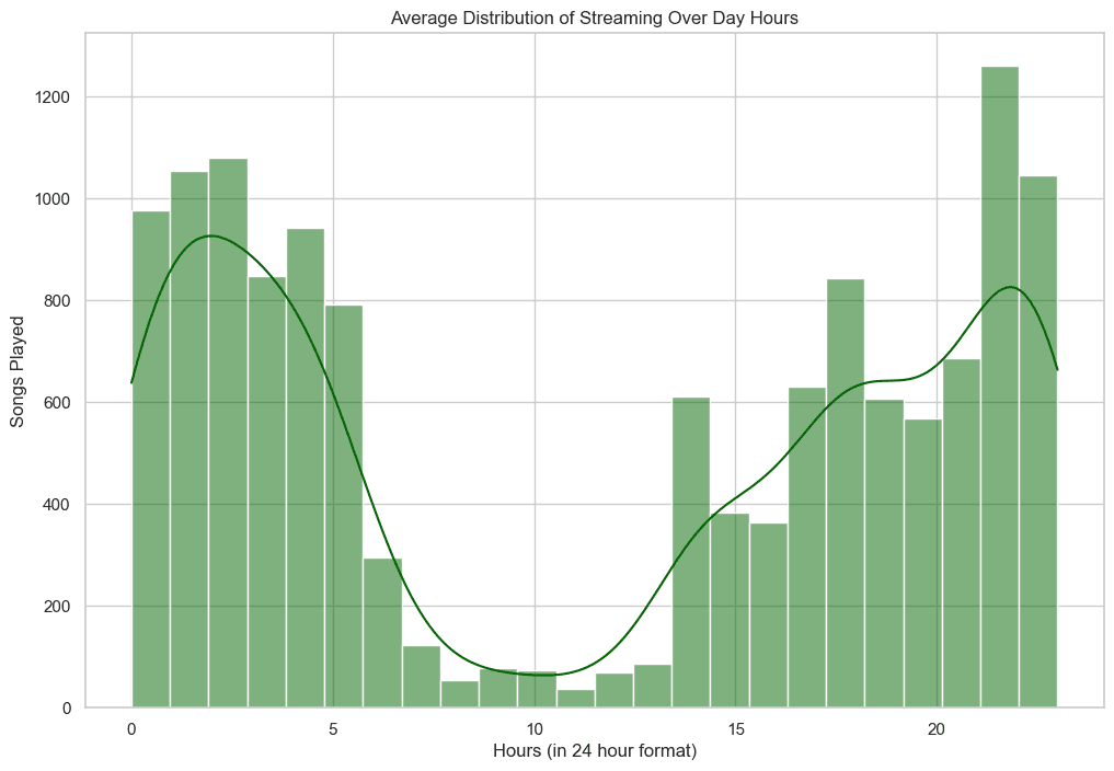
I am not sure what time zone these values are provided in but I don't think these are in my local timezone. The large gap is most likely when I sleep so it seems that the time is shifted 7-8 hours and my timezone is UTC-7 which makes me think that the data is in UTC.
Maybe I could find out if I looked at the docs but I'm too lazy for that..
Conclusion
This was a cool project but there is little to be gleaned from the data. I hope you enjoyed reading it and maybe learned something new. Feel free to use my code from the GitHub repository and analyze your own Spotify data.
If you have any questions or feedback, please don't hesitate to reach out.